
Falafel Tokyo is a vibrant food brand specializing in Middle Eastern cuisine, particularly falafel, with a focus on bringing authentic flavors to Tokyo. As the designer, I was tasked with creating a logo that reflects the brand’s playful, cultural identity while appealing to both locals and international visitors.
Challenge
The challenge was to design a logo that:
Captures the essence of falafel culture and Japanese fusion.
Appeals to a sdiverse audience, including food enthusiasts and casual diners.
Balances fun and professionalism to create a memorable and recognizable brand identity.

Concept Development
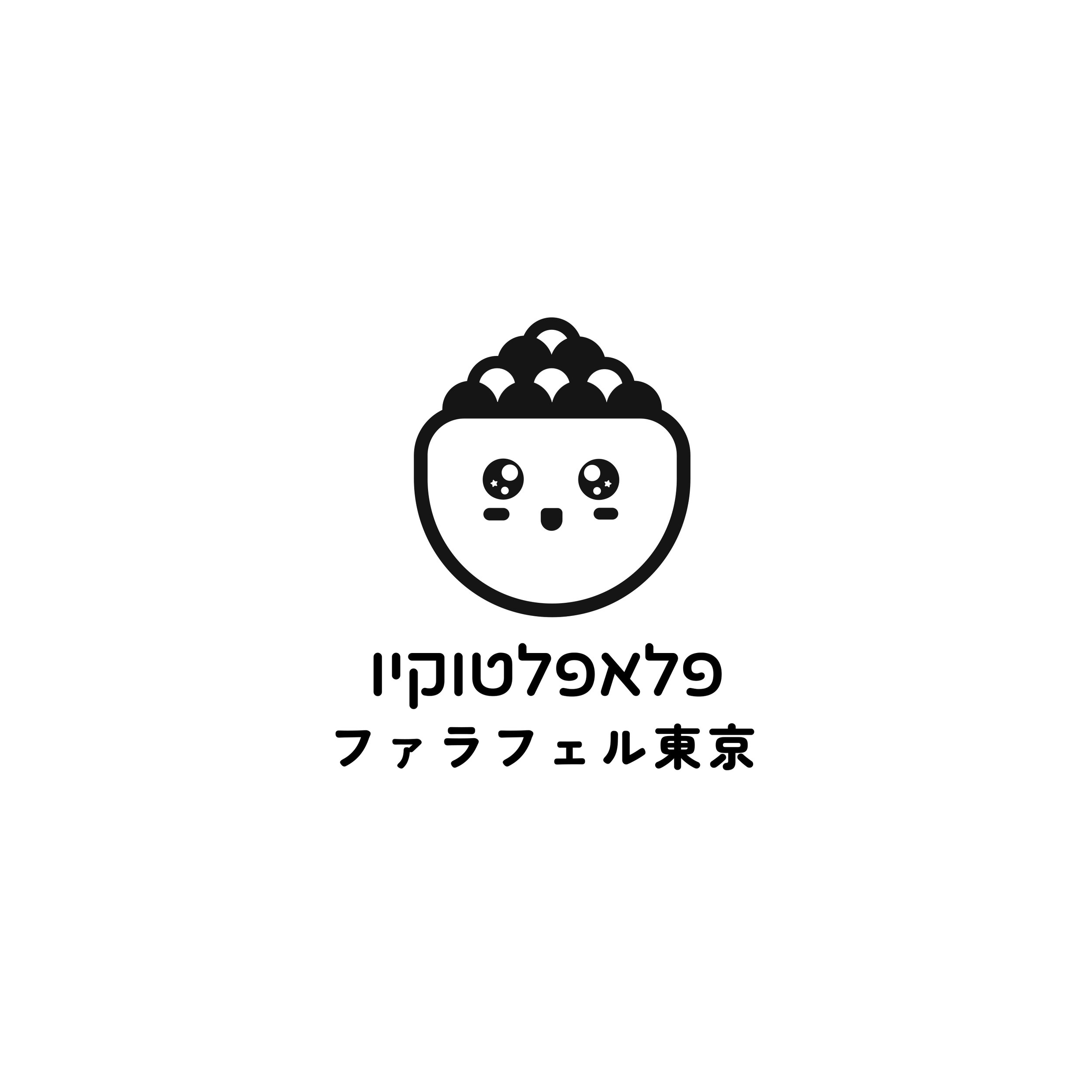
Cultural Fusion : Combined elements from both Middle Eastern and Japanese cultures to create a unique identity. The logo incorporates Hebrew (for authenticity) and Japanese text (for local relevance).
Playful Visuals : Designed a cute, anthropomorphic falafel ball with expressive eyes and a smile, giving the brand a friendly and approachable personality.
Logo Design
Icon : Created a simple yet charming icon of a falafel ball with a face, symbolizing warmth, friendliness, and deliciousness.
Typography : Used a clean, modern font for the English and Japanese text, ensuring readability and professionalism.
Language Integration : Included both Hebrew and Japanese text to reflect the brand’s multicultural appeal:
Results
The Falafel Tokyo logo has been well-received, achieving the following outcomes:
Brand Recognition : The playful falafel ball and bilingual text make the logo instantly recognizable and memorable.
Cultural Appeal : The design effectively communicates the brand’s fusion of Middle Eastern and Japanese cuisines, resonating with both locals and international visitors.
Versatility : The logo works seamlessly across different applications, from social media profiles to restaurant signage.